
See You There
'See You There' (2024) is a new future-focused 1-of-1 piece of longform, participatory, onchain (SVG), generative artwork that will take 5 years to complete. During this time, it captures the provenance of its own ownership, colouring in a spiral as sections over the 5 years. Each section represents a period of more than 2 weeks where the artwork was held by an address. If it is transferred sooner than 2 weeks since the previous transfer, it won't record that as a new section.

Writing A Novel Draft in A Month
In November 2022, I took a part again in National Novel Writing Month (or more popularly, shortened: NaNoWriMo). The goal is: write 50,000 in 30 days of a novel. Many authors tackle it yearly. The official stats for 2022 says that: “51,670 writers met goals to become NaNoWriMo winners, including 21,326 young writers.” I succeeded by tackling a draft of the sequel to “Hope Runners of Gridlock” by writing 51,591 words! Here’s what I learned.

On Writing in 2023
Since I actively started blogging a few years ago, 2022 is the year I blogged the least. It’s due to a confluence of reasons. To change, I’m starting a new experiment to get back into regular writing that’s also about navigating social media in 2023. I’m starting a weekly newsletter called “Scenes with Simon” that’s primarily a space for sharing links and commentary.
Staying On The Story’s Trail: The Hats in Andor’s Reckoning
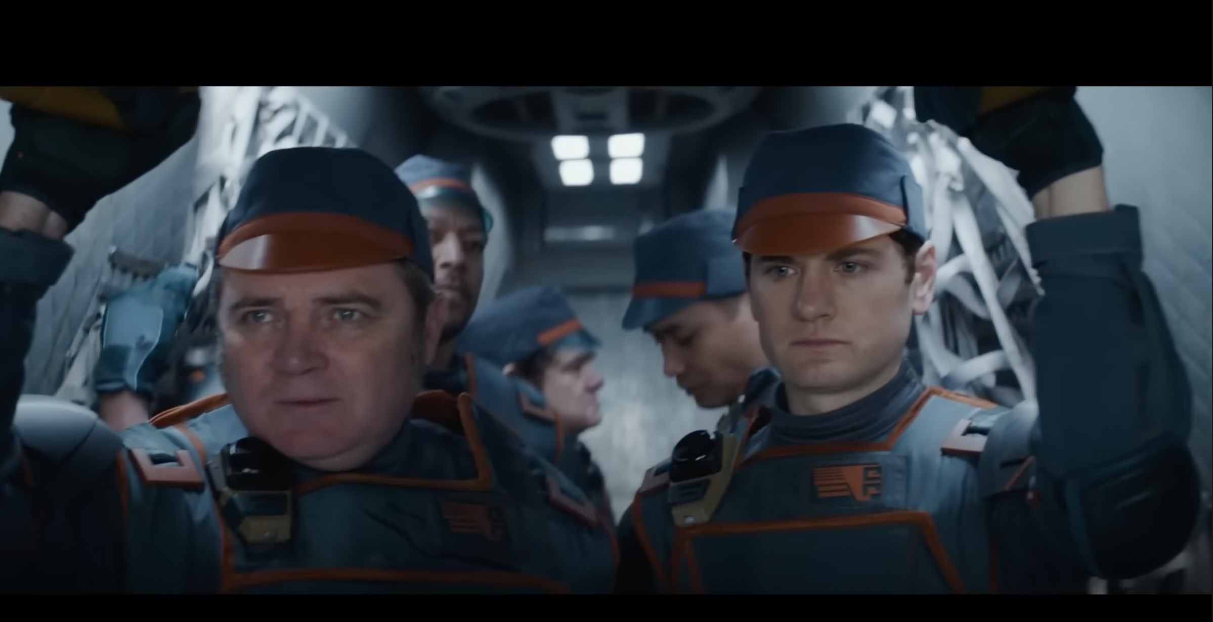
Much of the success of a storyteller doesn’t have to do with the world, the characters, and the plot. It’s also about ensuring that the story stays on its trail. It’s the meticulous and detailed process of making sure the reader/viewer/listener does not get confused. In this post, I will detail a simple example from the recent Star Wars TV Show: Andor.

New Short Story: The Serendipity of Self
I wrote a new short story: The Serendipity of Self. Suffering induced memory loss, Grayson wakes up to a world where everyone’s private messages were leaked. Delving deeper, he comes face to face with a surreal new reality.

Time-As-Platform: Ether’s Phoenix & The Memorial Monument
Due to the ever-growing immutable history of blockchains, the longer they exist, the more possible it becomes to interact (and transact) with the future and the past. It brings about strange, emergent outcomes that include: hyperstructures (free, yet valuable infrastructure), abundant retroactive funding (Ether’s Phoenix), and re-animating the dead. After just over a decade of existence, time-as-platform is slowly emerging and could redefine all manner of new social structures, art, and philosophical questions.

Building Expansive NFT Universes: CC0, Fidelity, & On-Chain Bundling
NFT creative universes are undergoing an exciting phase of wild experimentation: emphasising free IP, new economics, and remixing. As these universes develop, there’s three key components that can help foster success: permissive licensing, low fidelity + metadata, and on-chain bundling.

The Rewiring of the Niche: Selling Out, Commons Databases, & NFTs
New technology can change our relationships. When this happens, it both enables new ones to flourish while at the same time reframing or destroying old relationships. The former can be joyous, wonderful, and the latter can hurt and be depressing. A blockchain, a database in the commons, does both. New connections, new relationships have been forged while at the same time, with NFTs particularly, it’s ripping through old, established relationships. Besides the general critique against blockchain technology: environmental concerns alongside naked greed & speculation, I believe this effect - technology rewiring relationships - is a part of the unexamined nature of the unease. Why and how is blockchain technology (particularly NFTs) rewiring relationships?

The Signature: Exploring Time & Provenance in NFT Art.
“The Signature” is a conceptual art project that explores the importance of the provenance of an artwork in relation to it being used as an NFT.
Hope Runners of Gridlock Audiobook
I created an audiobook experience for my debut novel: “Hope Runners of Gridlock”. It includes GAN imagery & a backtrack. I also philosophize on the future of AI-assisted creations.

Decentralized Autonomous Artists
On Oct 24, 2021, Botto, a “decentralized autonomous artist” sold its first work for ~$325,000 (79.421 ETH). Slowly, but surely, all the requisite components have matured for crypto-based autonomous artists to take center stage. We now have broader adoption in crypto, NFTs, DeFi, DAOs, GPT-3, Generative Art, & GANs. There are a handful of projects exploring this intersection, and they surely won’t be the last. Let’s delve into what they are, and what could likely happen. I’ll cover early explorations (Plantoid, AI ArtDAOs, Artonomous, Clovers) to current projects like Neolastics, Abraham, NounsDAO, & Botto.

Flavours of On-Chain SVG NFTs on Ethereum
NFTs, as unique items on the blockchain, has a URI that points to data containing the metadata & the corresponding visuals. This URI can be an HTTP link, pointing to a video or image hosted on a normal server, or other services like IPFS (hash-based addresses), or Arweave (incentivized hosting of hash-based content). There is another way, however, a format that's become increasingly popular: the usage of a data URI. These URIs contain all the information within it. There is thus no server at the other end. Using data URIs has allowed NFT creators to experiment with putting all the content related to an NFT 'on-chain'. It adds a vector of permanence to the art. If Ethereum continues, it does not need ancillary infrastructure to support it. A common format currently is to store the NFT visuals as SVG, since most browsers are able to natively parse it. I do a deep dive in how different projects have been using SVG on-chain.

Top-Down vs Bottom-Up Fiction Using NFTs
A good story makes you feel something. Having ownership over the story makes those emotions stronger. Telling fiction with NFTs can be a powerful way to tell stories: both old and new. Projects have been exploring this intersection the past few months. There is a tendency, however, for projects to take a more top-down approach while NFTs can & should explore bottom-up storytelling as a new medium. Top-down fiction is what’s being told to us. It’s when you go watch Star Wars in the cinema or play a new role-playing game from Bethesda. Bottom-Up fiction is what we invent stories about the fictional world on our own. It’s when you’ve bought the lightsaber and you are running around in your yard making fuzzy whoosh noises, force throwing tennis balls at your dog. It’s when you roleplay in World of Warcraft at the local tavern outside Stormwind. In this article, I want to share what this looks like in practice with NFTs and where I see this going into the future.

Exploring NFT Economies: Creators, Collectors, & Collection Sizes.
With NFTs blowing up, there's been quite broad experimentation regarding pricing, sales, auction formats, and collection sizes. What an NFT is supposed to represent (from art to virtual real estate) can be quite broad, but regardless of that there still exists interesting tensions between the creators, collectors, and the size of collections. These tensions aren’t new. I can bet that the trad art world, trading card game designers, sneaker designers, and many in-between have given these questions some considerable consideration before. What’s new with NFTs is that 1) the asset lives on the same substrate as where the auction/sale occurs, and 2) we have native, beautiful, open source data to dissect. While I have written before about collection sizes (and designed a new implementation using bonding curves), I want to delve a bit further into these tensions: the creator vs the collector, and collection sizes.
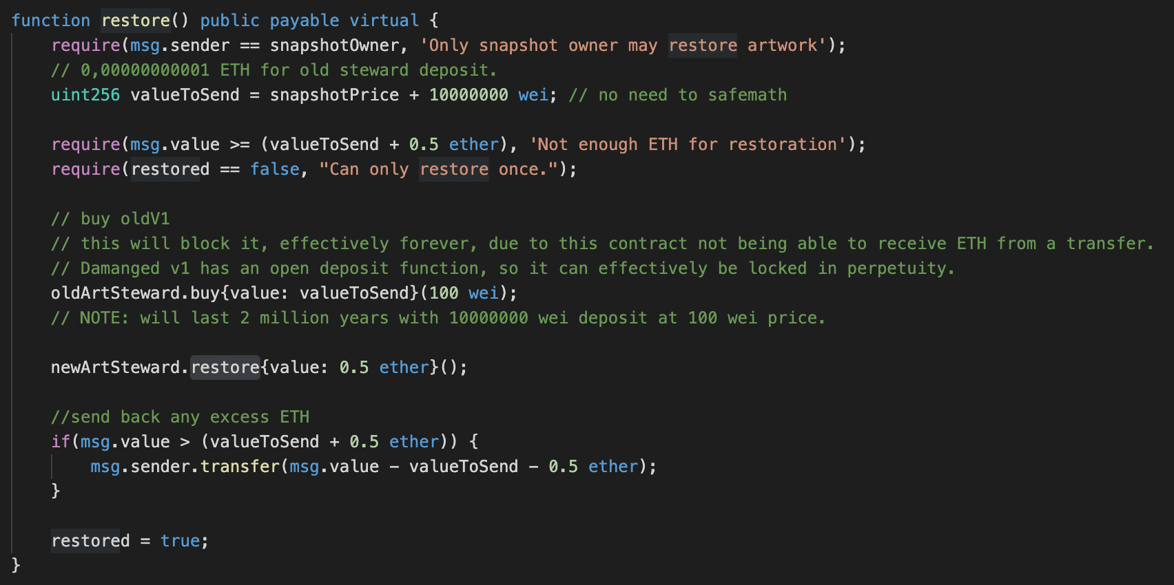
The Story of Restoring A Digital Artwork That Is Always On Sale
Art restoration & conservation is a natural part of the lifecycle of physical art. In some cases, like in Japanese Kintsugi, the repair of an object is made visible, and is seen as desirable. What happens in the case of a digital artwork NFT? Or, perhaps, even more complicated: what happens in the even that it is also an artwork that is always on sale? Due to damage in the first artwork that is always on sale, along with the help of the patron, I restored it.
Exploring NFT Expansion Packs
One of the interesting components about NFTs-as-media is that most of them can be programmed. This opens up the possibility of adding additional features (new visuals or functionality) to them in the form of expansion packs. This can either be officially licensed, or in the case of permissible licensing (creative commons), be freely remixed and played with by community members. I want to explore what expansion packs could look like.

Exploring NFT Collectibles for Authors
A key thesis, substantiated by many others in the industry, is that digital collectibles, through non-fungible tokens (NFTs), can reinvent the creative economy. It’s subverting the creative work: make it as accessible as possible and sell digital collectibles related to the creative work. Thus: instead of trying to restrain or restrict creative works, it’s more valuable if it’s more freely available and accessible. It’s a holy grail for content. I chose to experiment with this for stories.
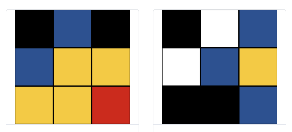
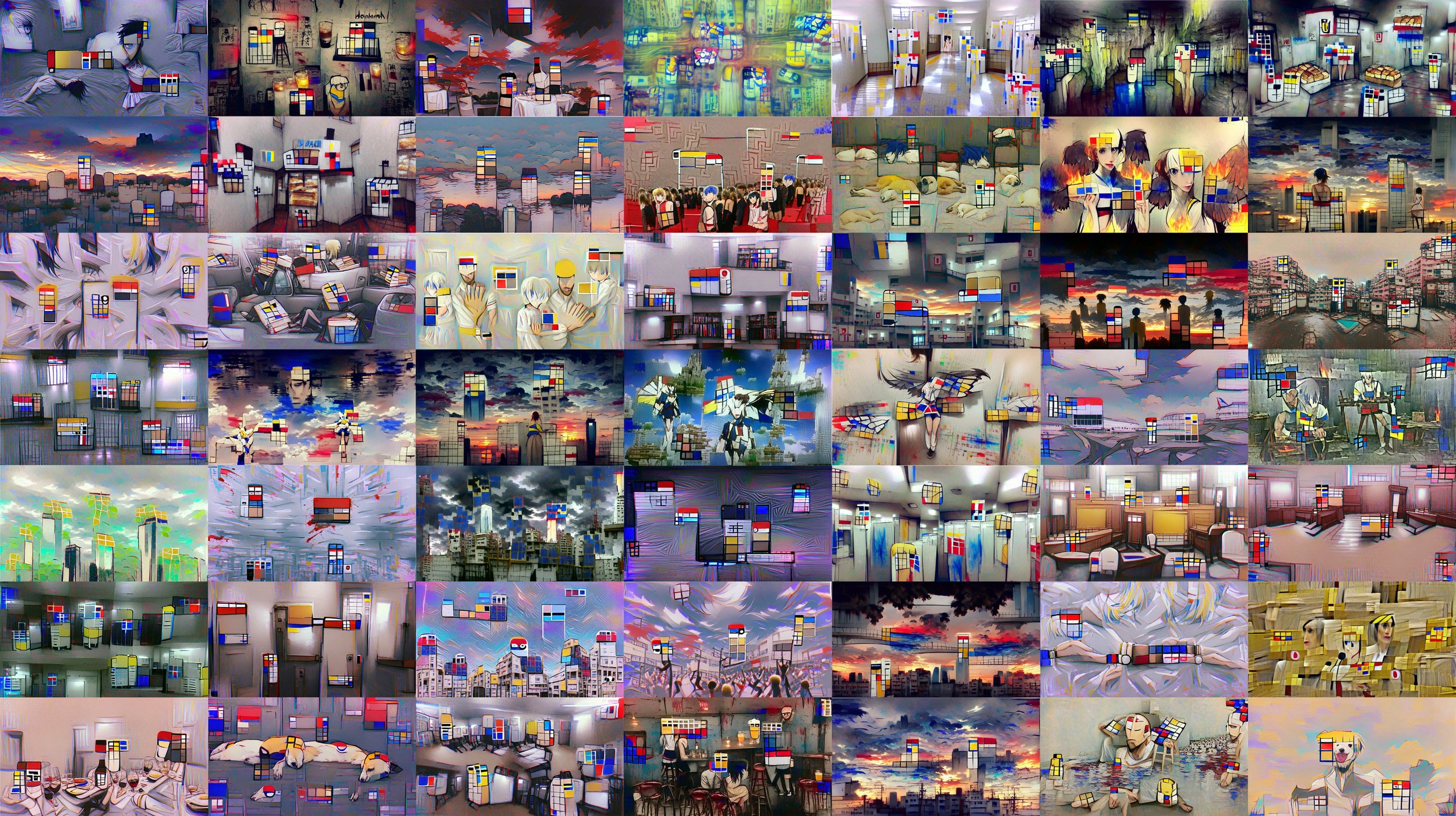
Neolastics: Liquid, On-Chain, Generative Art
Neolastics is a new digital art project that I created that allows collectors to mint (and burn) new randomly generated pieces of neoplasticism inspired digital art. It’s liquid, meaning that at any point, a collector may choose to burn their piece to receive a reward from a communal reserve (a bonding curve). This project is a continuation of experiments and ideation from 2016 around the creation of autonomous artists.
HROG #3: The Process & Learnings of Writing My Debut Novel.
I’m lucky to enjoy a broad range of creative endeavours. I’ve run the gamut: from making art, music, games, software, to acting, and writing. A line that runs through all of them is the ability to tell a story. So, writing a novel is one such tool: something I wanted to do, to learn to tell a different story. I documented the process to share what I learned.

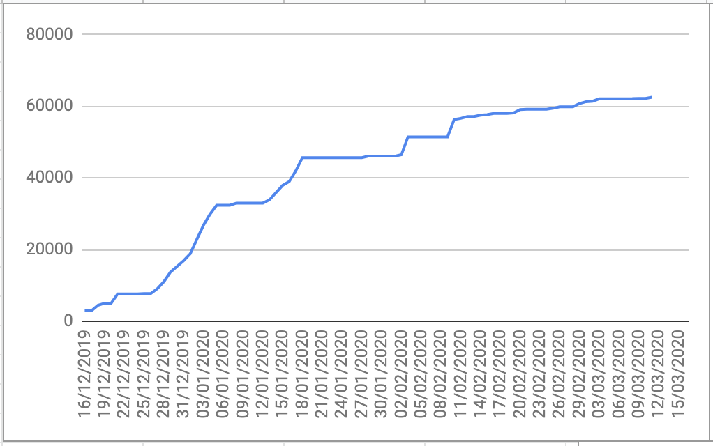
Experiments in Self-Publishing A Novel. One Month In.
I recently self-published my debut novel on October 24, 2020, called “Hope Runners of Gridlock”. It’s about finding hope in a cyberpunk city with radical markets. Thought I’d share learnings and statistics, one month since launch. I am busy writing a separate article entirely on the writing process (that’s part of the original companion guide). This is about publishing.